Hello everyone,
I just recently tried out new layouts in both my planner and my bullet journal and I thought it would be worth sharing. So here we go!
During the last couple of weeks I realized that having some kind of
weekly overview in my
planner would be great. Inspired by YouTube lady
Ella The Bee I first tried this:
It's basically the result of squeezing Saturday and Sunday on one page and then recycling the Sunday page for a weekly overview of the following week.
Truth to be told, I tried this a couple of time throughout the month of September but didn't really feel comfortable with it. It reduced the space available for Saturday and Sunday plus I took me quite some time to draw out the spread.
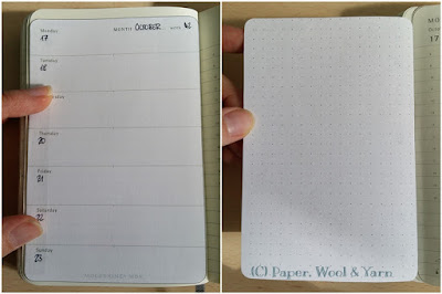
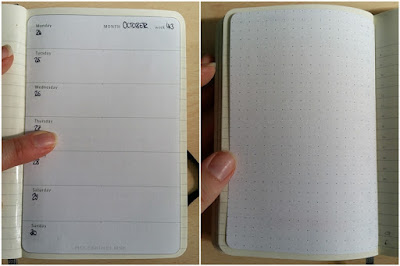
During my second attempt to integrate a weekly overview, I simply used a Moleskine template which I printed on plain white paper, cut out and taped inside my planner.
 |
| Taped to the left page, dot grid on the back for taking notes |
 |
| Integrated as a new page, dot grid on the back for taking notes |
Depending on the page on which each week started, I either taped the weekly overview to the left page or integrated it as some kind of additional page. So far I like it. I'll do a test run throughout October and then decide how to proceed with November and December.
My
Bullet Journal that I use for work also got a little make-over.
I also experimented with some different kinds of
weekly overview layouts. So far this one seems to be the winner:
It integrates both the actual week as well as the following one, has a quick overview of the month (top right) as well as some space for miscellaneous notes (bottom right).
Alright, that's it for today.
How is your bullet journaling and planning coming along? Did you also make some layout changes recently?
Yours
Uta
PS: To read more about my planner as well as my bullet journal look right
HERE ...


